Options and settings are set by default to the most likely choice we identified but tuning them lets you create the application you want rather than the one we think you would like.
Data Type Settings
The main data type settings are applicable to all data types in your application.
Visual aspect of type
This is the default way the data will be displayed and how the data will be constrained. This is also called the Data Type
Type Name
The name of your type is used to show on forms and label your data on graphs, analysis, visualisations, tables, etc. You can change it anytime.
Description
This is the type description. It is used to help you used but also, if you enable app access selling, to tell you potential users what they will have access to on your app landing page.
Object Types Settings
Objects data types are data types that contain other data types. They have their own page in the documentation to help you choose the object data type that fits your need: Objects. Here, we have additional settings that can apply to all objects.
Basic Settings
Default table display page size
When showing the data in a table, the data is shown in pages so that your browser is not overloaded. Smaller pages makes the app more reactive and faster. Larger pages are heavier on the system and makes your app slower.
Transformation templates lets you define document templates for transforming records into prints, documents or exportable text.
Listing Behavior
Enable Barcode Direct Access
This adds a direct access field that allows scanning a barcode to open the record directly.
Show barcode
Display a barcode representing the record internal identifier on the record so that it can be used for direct access.
Popup form
The possible values are: Extensible popup, Popup only, Full screen only. This changes the way record editing opens. The default is a popup that can be extended into a full screen edition. For the technical part: popups are open through url arguments while full pages have a full url.
Read-only first
The possible values are: Combined view/edit button, Edit only, Read first. Popups can be in edit or view mode. This dual-behavior is expected by some users but confusing for others. Here you can choose between only edition (unless the user does not have the rights), default read (the user need to manually toggle to have edit access), or dual combined button. This applies only to popup views.
Don’t open on creation
When creating a record, the platform typically opens that record for edition by default. This setting prevents opening. This is very useful when records data input are fully automated by formulas.
Input form Header
Change the width of the popup
For viewing some data and depending on the typical device of your users, a narrower or larger screen may be more comfortable. (Extra Small width, Small width, Medium width (Default), Large width, Extra Large width)
Hide the save button
Simitless saves data automatically. However, there still is a save button as many users were lost without it. All it does is confirm when things have been saved. If the user’s connection dropped, the platform cannot save. This button will not change that.
No print button
Don’t show the print button (This does not prevent printing when using the browser button or "Ctrl+p").
Hide the button labels
Hides the labels from buttons on a data record popup to have a cleaner screen.
Move the delete button
The delete button is sometime an element that should not be put forward. This option lets you move it to a more discreet location, without preventing deletion if it’s really needed.
Hide the title on top of the data record
The typical data record has a title on top of the form, above the menu. This option hides the title on top of the record.
Hide the title and menu of the data record
The typical data record has a menu and title. This option hides the title on top of the record.
Hide the footer of the data record
The typical data record has a footer to navigate. This option removes the footer and cleans up the screen.
Hide the footer creation menu in the data record
The typical data record has a footer with a record creation and duplication menu. This option removes the footer and cleans up the screen.
Hide the footer copy options
The typical data record has a footer with a record creation and duplication menu. This option removes the duplications options.
Hide the copyright snippet
The typical data record has a footer with a copyright mentioning the license applicable for this record. This option removes the footer and cleans up the screen. This may leave the user wondering what licence applies or effectively apply the app global license to the record. Please make sure you are certain of what your records should be licensed as.
Hide the links list at the bottom of the form
When records are linked in another record, the system keeps track of those link and displays "back links". This option prevents displaying the backlinks at the bottom of the record.
Data Listing Display
No title
Don’t show the type title in listings
No print button
Don’t show the print button (This does not prevent printing when using the browser button or "Ctrl+p")
No export button
Hide the option to export formatted data. It does not prevent tech-savy users from accessing data through the code but it makes it slightly less practical to do. (By definition, if they can see it, they can copy or export it.)
No import button
Hide the facilities to access the data import. It does not remove the import fully but it makes it unaccessible while the button is hidden. To access import you can always use the url (add "/import" to the main type address)
No search settings
Hide the search settings
No bulk action
Hides bulk action tools
No view switch
Prevents users from changing the view on this type when listing all
No column selection
Prevents users from changing the columns shown in the view
No Result Count
Hide the number of records at the end of the type lists.
No page size
Hide the option to change page sizes.
Hide tree view button
Removes the navigation button allowing to jump between main types.
Field Types Settings
Fields data types are a definition of the value that each of the data record will hold. They have their own page in the documentation to help you choose the field data type that fits your need: Fields. Here, we have additional settings that can apply to all fields.
Basic Settings
Unit
This field allows you to display a unit you want the data to be input into alongside the input field.
Default Value
This is the default value for that field. Whenever the data is created, the value entered here will be input by default.
Calculation
Some times, fields don’t have to be manually input into you database. If you can think of any way to automate the calculation of their value, you’ll gain even more time. See the Calculations documentation
Highlights this field as a required field. As saving data is done as the user type, it is not possible to enforce that a value is there if the user really does not want to give one out but this will highlight the field if a value is not present.
Unique values
Mark this field as requiring unique values. The same value cannot be repeated in various records.
Don’t record history
This option prevents recording the history of a field. This, first, lightens up the system (and can make some mild performance improvement on a busy field), but mostly, it may be important for information that is more of a confidential nature. This allows not letting loose ends around.
Display Behavior
Read only field
Some times, you may want a field that is simply here to be read, no editing. That’s probably true especially for calculated fields.
Hidden field
Hidden fields can be quite useful to calculate intermediary values in your app. They can help for calculated values, conditions, required values, etc…
Inline Edition
Enable edition of this field directly in the table. Some other objects allow inline edition such as cards but not others such as calendars.
Form Positioning
Hide field name
This option hides the title or name of the field in forms. The name is still displayed on tables and global headings.
Hide data type icon
The icon is a visual reminder of the type of data that is being input. This option hides the data type icon.
Hide the green validation glow
Hide the green indicator indicating a successful validation of the various constraints. Only the red glow will appear when there is an issue.
Hide all options indicators
Options usually add an icon next to the title. With this option, all icons are hidden.
No frame when viewing data
Remove the visual frame indicating an input field when viewing data.
Force a different width than normal
Make the field a different width than its natural "as designed" way. Sometimes it may be helpful, sometimes, it may break the look of your apps. Use with caution. Possible values: 1/12, 2/12, 3/12, 4/12, 5/12, 6/12, 7/12, 8/12, 9/12, 10/12, 11/12, 12/12
Don’t pad fields
Let fields be next to each others. Typically, the fields are stacked one after the other in a form. Some times, you may want to display two fields side by side by removing the blank space they have next to each others.
Add a line under the field
Maybe you want to split your form visually. This options lets you add a line under the form. (<hr>)
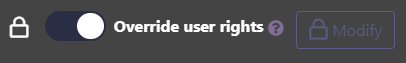
Override user rights
Override user rights setting
A setting to override user rights is available on all data types. This enables you to define specific rights for a data type only while different user rights are defined centrally in the app. Check the data types user rights page for more information on this feature.
Settings history
Whenever a piece of data is edited, Simitless keeps track, not only of its past values, but of the users who edited the data in the last 3 months. The documentation page on Settings history will provide more details on its action and limitations.